Workplace safety signage: Eight tips to make them safer
When it comes to managing health and safety risks in the workplace, appropriate safety signage is one of the key tools in an HSEQ’s toolbox.
Outside of the visual prompts required by law – such as the standard signs to identify first aid locations and firefighting equipment – signage can be used in a number of ways to reinforce safety protocol and reduce the risk of accidents and injuries.
The role of workplace safety signage
Workplace safety signage may be used to:
- Warn of hazards in the workplace, like electricity, water or moving vehicles
- Educate on the correct way to complete a health and safety critical task, such as handwashing or fitting PPE
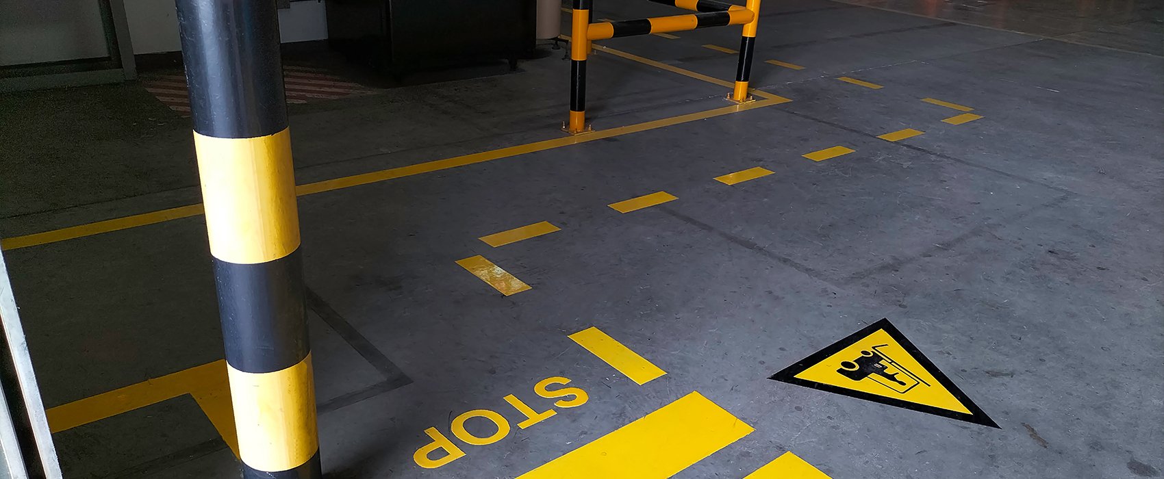
- Remind employees and visitors alike of the correct safety protocol, such as the need to stick to pedestrian walkways in areas where forklifts and other vehicles may be working
- Encourage employees to be mindful of their own and others’ health, safety and wellbeing needs
But, when it comes to safety signage, more isn’t always best. It’s quality, not quantity that counts.
Workplace safety signage: Avoiding visual overload
Whether we are consciously aware of it or not, as human beings our brains are constantly receiving and processing different messages received from the environment around us.
Scientific studies have shown that our senses send around 11 million bits per second to our brains. Our conscious minds are only able to process around 50 bits per second, so everything else is processed outside of our direct conscious control – if it registers at all.
Our brains can only process so much information at any one time. Anything outside of this – no matter how valuable – simply does not register.
With this in mind, it is vital that safety signage is designed to be as effective as possible. Here are eight tips to get you started…
Eight tips for more effective workplace safety signage
1. Consider placement
2. Minimise distractions
3. Rotate and refresh
4. Make them eye-catching
5. Supplement, don’t substitute
6. Don’t try to do too much
7. Less is more
8. Colour-code
Consider placement
Some safety signage – such as that warning of a specific hazard or relevant to a particular area of the workplace – will need to be located accordingly. With general safety signage, it is a good idea to place signs in high-traffic areas where people may safely and conveniently ‘stand around’, giving them chance to read them. This includes toilets, rest areas and hallways.
Minimise distractions
Avoid grouping safety information together wherever possible. No one is going to stand and read a board full of safety information on their lunch break, so spread signage throughout the workplace to avoid important health and safety messages getting lost in ‘noise’ and ‘clutter’.
Rotate and refresh
If something is left in one place for an extended period of time, it fades into the background, falling into that void we mentioned earlier where your brain ‘tunes it out’ to focus on new information coming in. One way to counteract this is to rotate your safety signage every so often, relocating signs to new locations, or refreshing their design.
Make them eye-catching
You want your safety signage to stand out, so consider what tools you have at your disposal to grab the attention of your employees and visitors. Can you use humour where appropriate? Or ask your team to get involved by making suggestions or even offering their own designs?
Supplement, don’t substitute
It’s important to remember that safety signage is not a substitute for safety training. It is intended to reinforce and remind – not to give new information. Where you are talking about a topic in a safety briefing, it may be useful to have an example of the relevant safety signage close at hand, and to ensure that the messaging you’re giving is consistent between the two.
Don’t try to do too much
Keep it simple. Stick to one idea per safety sign and concentrate on communicating that message clearly and in a way that will be memorable. Including multiple messages on one safety sign risks confusing people.
Less is more
By the same token, keep your safety signs straightforward, and any wording clear, unambiguous and to-the-point. It is always a good idea to consider non-English speakers and use imagery to convey your point wherever possible. Human beings are primarily visual learners, so visual as well as textual prompts will also help ensure your messages are received and retained.
Colour-code
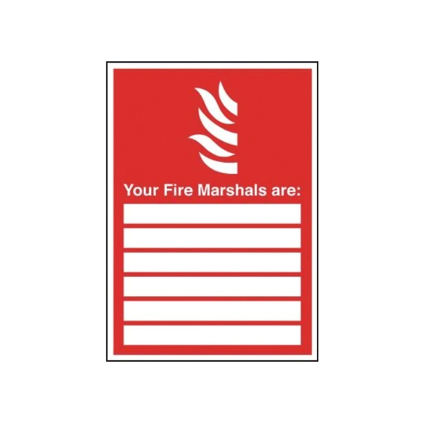
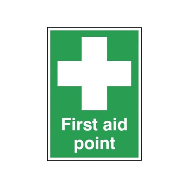
Everyone knows that first aid signage is green and fire safety signage is red. Can you implement some form of colour coding for other safety signage in your workplace, to help employees mentally link related safety critical information, and to aid instant recall in the event of an incident?
To view our range of standard safety signage, or to talk to us about your workplace’s bespoke safety signage needs, give us a call or get in touch via the website.
Related Products
 1
1
Fire Signage
More options available. For bespoke fire signage please contact us
 2
2
Traffic / Pedestrian Signage
3mm aluminium with a durable Class Ref 1 reflective face. More options available
 3
3
First aid signage
More options of first aid signs and materials available
You might also like

How to improve health and safety in the workplace - 4 proven steps
